Motorola Droid X2 Review - A Droid X with Tegra 2
by Brian Klug on July 7, 2011 8:31 AM ESTMotoblur by any other name...
When I reviewed the original X, it was on Android 2.1. At that time, most of my criticisms centered around the fact that 2.2 was out, and that the device already felt subjectively behind because everything around it was on 2.2, including even the original Droid.
It’s sort of frustrating that we’re repeating essentially the same scenario but bumped up one version of Android. This time, the X2 is launching running 2.2.2 in a world where 2.3 is king. Ironically, this time around, the original X is running 2.3.3 at the same time.
The other thing that’s changed is that while Motoblur is still around, it isn’t called Motoblur. Head over to Motorola’s specifications page for the X2, and you’ll find no references to anything called Motoblur, which used to have its own section for the X. It’s all semantics, however, because Motoblur is still present on the X2.
That said, I’m finding Motoblur a lot less annoying this time around. First off, the color scheme has changed to a much darker blue theme. Previously, everything was black on white. Now things are white on black. This same theme has made its way onto the X as well, so if you’re already familiar with how things look and feel there, you can probably skip all of this.
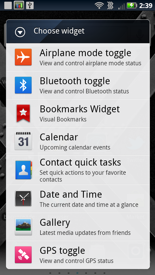
Motoblur essentially consists of a combination of UI skin, multitouch keyboard, special widgets, a different launcher and application switcher, and optionally some account management. For the most part, the first three are acceptable, the fourth decent, and the last one something to avoid.
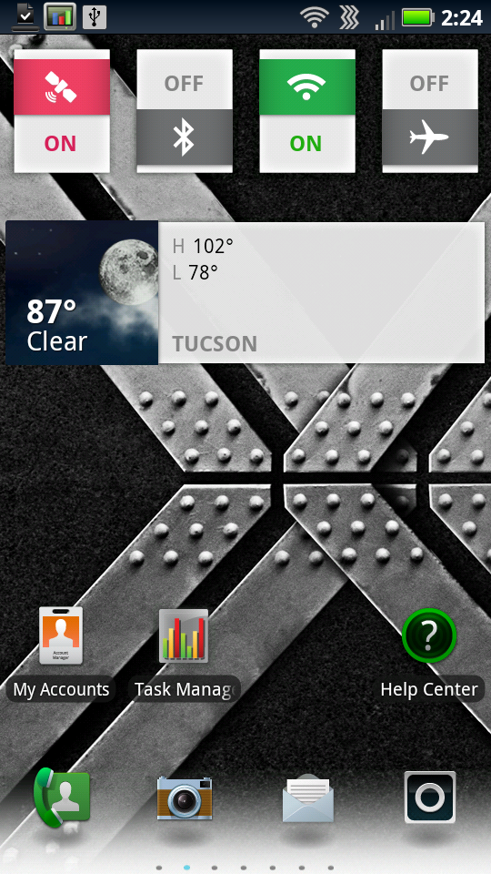
I stated that things are more blue now, which is definitely the case. The status bar up at the top is blue and has white iconography. Likewise, drag the shade down and you’ll see lots of blue everywhere. I can live with this, especially considering some of the other atrocious color choices I’ve seen UI skinners make (both handset OEMs and enthusiasts alike).
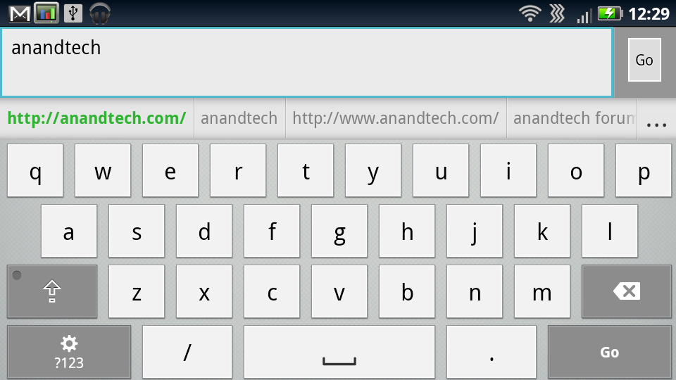
Likewise, under this UI menus and dialogs get a blue/grey makeover. Motorola also still includes its own multitouch keyboard, which was a welcome breath of fresh air back when it was included on 2.1. Since then, Google has made its own multitouch keyboard in 2.3, but Motorola’s still is impressive and gets the job done. I sound like a broken record but yet again if you’ve gotten used to the keyboard on the X, there’s no re-learning necessary on the X2. Motorola even keeps the buttons the same size despite the X2’s higher PPI display - a subtle but much appreciated thing.
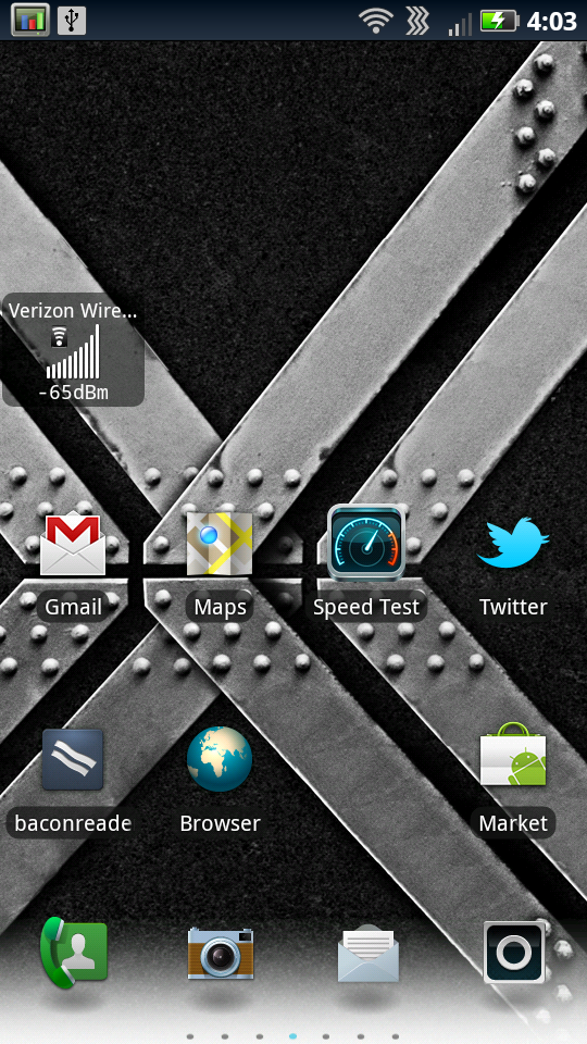
Motoblur widgets haven’t changed since I last saw them, they’re still stylized and overtly colorful, if sometimes a bit garish. Like we discussed in the X review, you can resize most of them by long pressing and then dragging the corners. Not everything always re-sizes vertically and horizontally, but usually you can experiment and make things fit accordingly. The default widget layout on each homescreen actually is just how I remember it being on the other X as well.


72 Comments
View All Comments
HangFire - Thursday, July 7, 2011 - link
When are you going to review the Charge? Now, there's a screen!HangFire - Thursday, July 7, 2011 - link
Oops I see it has been reviewed, but it is missing in the third comparison graph- Contrast- on page 2.HangFire - Thursday, July 7, 2011 - link
Page 5? I'm sorry I'm used to MODERN comments section with at least a 60 second edit feature.Brian Klug - Thursday, July 7, 2011 - link
It isn't missing, it simply isn't included. The effective contrast of the SAMOLED+ panels is undefined (divide by zero).-Brian
Vepsa - Thursday, July 7, 2011 - link
What app do you show in the GPS testing screenshots?Brian Klug - Thursday, July 7, 2011 - link
I like to use GPS Test Plus, it does a decent job.-Brian
cditty - Thursday, July 7, 2011 - link
No reason to upgrade... I bought my Droid X for .01 from Amazon when I rid myself of the craptastic AT&T in my market.It is the best phone I ever had (I was an iPhone 4 user on AT&T). Verizon's network is what makes me say that, because ALL of the phone works ALL of the time (calls & data).
The original X is plenty fast. My next upgrade will be when my market goes LTE (a long way off). By then, there will be some great phones to be excited about. Funny how phones are the new *upgrade* hobby for old school computer enthusiast.
silow675 - Thursday, July 7, 2011 - link
Brian I think you have the best mobile handset reviews. Great work on including thorough reviews on mobile displays - something lacking in most mobile reviews.Spoelie - Thursday, July 7, 2011 - link
That thing looks hideous compared to recent HTC ventures, like some 80's throwback.Mind you, I'm not talking about performance or usability or screen quality or ... It's purely my own opinion on physical styling of the device.
jonup - Thursday, July 7, 2011 - link
Well, we spent the 90s and the better part of the last decade making phones smaller and more portable... and then all the effort went down the drain.You can thank Apple for that. After the iphone everyone try better them with bigger and heavier phone. Remember, in America bigger is better!