Windows 8 Consumer Preview: A Quick Look at Battery Life (Updated)
by Jarred Walton on March 1, 2012 2:15 AM ESTWith each new operating system in recent history, Microsoft has promised better battery life. We tested this back in the early days of Windows 7 and found that while Vista was generally a step back relative to XP, Windows 7 fixed much of what was wrong and even managed to beat XP in several tests. With the Windows 8 Consumer Preview now available, we thought we’d run a quick test on a laptop to see if things have changed much. Let’s just get this out of the way, shall we?
Okay, that’s a pretty poor showing, but what’s really going on here? We’re using the same Sandy Bridge laptop that we tested back when Sandy Bridge first launched, a Compal manufactured unit with an i7-2820QM processor, 4GB RAM, and an Intel 160GB G2 SSD. So the hardware hasn’t changed, but battery life is much worse right now—and that last part is important: right now. We did a few tests of battery life with the Windows 7 preview and it didn’t look that great, but drivers and optimizations weren’t finalized, and Windows 8 CP is definitely in that same category. But there’s more to the story than just Windows 8.
As part of the Windows 8 CP experience, we’re also given the privilege of running the Internet Explorer 10 Consumer Preview (IE10CP). As we’ve noted in the past, the choice of browser can certainly have an impact on battery life, and that likely goes double when we’re looking at beta software for the OS and browser. I also performed an in-place upgrade from Windows 7, so it’s possible that could negatively impact battery life as well.
I've only had a chance to run the battery drain test once so far, so consider the above results very preliminary. I'm going to test it again, as well as go back and retest with Windows 7 (and IE9) to see if there are any other changes. The battery may not be performing as well as it did last year (though it seems to be fine based on HWmonitor reporting 2% wear level), but we'll hold off on any final verdicts for now. While I continue to look into battery life over the next few days to see if perhaps I missed something, it doesn’t look like Win8 CP with IE10 CP is going to do anyone any favors in terms of accessing the Internet while unplugged.
Update: In case you need further explanation, the results above are simply a first test of battery life using IE10 CP. I reran the test a second time and it improved slightly (263 vs. 250 minutes), but I'm still testing. There is also a newer Intel driver that I've now installed, which may help quite a bit for IE10. The above results do not say anything about idle battery life, battery life using Metro apps, battery life during video playback, etc. I am working on testing those items as well, and I have a second laptop that I'll be using to provide additional results. All we can say right now is that after first installing Win8 CP via an upgrade to Win7 and when using IE10 with Flash enabled, battery life looks poor—like, Safari browser on Windows levels of poor. That can and very likely will change before the final release, and the fixes will likely come in the way of driver updates as well as improvements to the browser.
Update #2: I've added results from a second laptop where I have done a clean install of Windows 8 CP. This time the laptop is the ASUS K53E with an i5-2520M processor. I did retest with Windows 7 running Internet Explorer 9 first, and I also swapped out the hard drive for a 64GB Kingston SSDNow V100. Results are much better than with the first laptop, but there are a few remaining elements I need to test. Again, consider all these results preliminary, but at least it does appear that Windows 8 with IE10 battery life may not be quite as bad as my initial results indicate. (Note also that using IE9 in place of IE8 actually improved battery life with the K53E and the V100 SSD—Win7 with IE8 scored 333 minutes. I'm not sure if that will always be the case, however, as I seem to recall seeing IE8 get better battery life on at least one laptop I tested.)
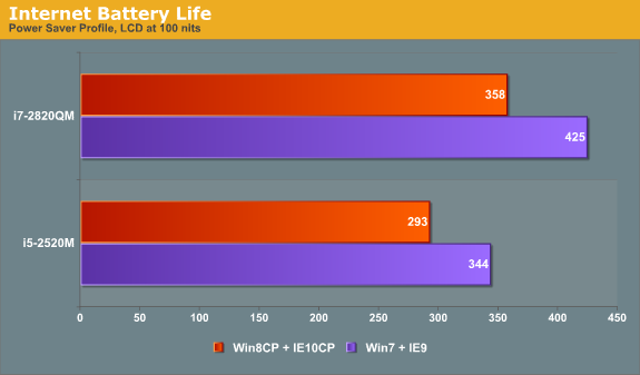
Things still waiting to be tested: first, I haven't finished retesting the i7-2820QM with the latest Intel HD Graphics driver [Update #3: the new driver did not change the result], second I need to retest it after doing a clean install of Windows 8 rather than an upgrade, and third I need to retest with Windows 7. [Update #4: I did a clean install of Windows 7 on the i7-2820QM and reran the Internet test twice. The first result was 393 while the second was 425, so other than variance between runs (possibly the fresh install somehow played a factor on the first run), it doesn't look like battery quality has deteriorated. The graph has been updated with the latest numbers.] I'll hold off on reporting idle/video/alternate browser battery life for a future article.
Final Update: After running numerous other tests in Windows 7 just to verify the numbers we had there (and in the process of working to put together graphs for a larger article), I started with a clean install of Windows 7, finished the benchmarks, and then did an upgrade to Windows 8. This time, the battery life is much better--358 minutes compared to 263 minutes from the original upgrade. It's likely that the original upgrade had a lot more stuff left over that somehow impacted battery life. Now, the numbers are much more in alignment with the results of the K53E laptop. We'll have full details on several battery life test scenarios in a future article, but there's still a drop in battery life right now of around 15-17%, mostly likely because of differences between IE9 and IE10CP.
And just as an aside, I know that Windows 8 isn’t final by any stretch of the imagination, but while the Metro UI (and UI changes in general) seems like it would work great on a tablet, I’m ready to go on record as saying I think it sucks for traditional desktop and laptop users. Without a touch interface, Metro feels weird at best and downright awful at worst. What’s more, getting a touchscreen for a desktop or laptop isn’t actually something I’m clamoring for. Does using a 24” or 30” touchscreen on my desktop sound enjoyable? Not at all, and a 15” laptop touchscreen wouldn’t be much better. Maybe it would help me build up a bit of arm strength, but that’s about the only upside. Add on fingerprints—a personal pet peeve that smartphones and tablets still suffer from—and I’m more than happy to stick with the “boring” old Start Menu. That’s just my initial impression of course; anyone else have similar—or different—feelings after playing around with the Win8 CP?


113 Comments
View All Comments
JarredWalton - Thursday, March 1, 2012 - link
Let's go through some problems with this Metro stuff.1) You can't see what's actually running unless you Alt+Tab or switch to the desktop.
2) To close Metro applications, if you don't know the Alt+F4 shortcut there's no visible way to exit.
3) As soon as you have a decent number of programs installed, the only reasonable way to find something is to type its name.
4) Thanks for assuming I "tried it for 10-20 minutes" -- more like tried it for several hours yesterday.
5) As mongster122 points out, this feels like Metro on top of Windows rather than a unified UI. It feels very forced right now on laptops and desktops.
I can keep going with lots of little tidbits that are annoying to me, but the basic gist is that yes, this is beta, but this is also getting close to feature complete. I don't like it already, and unless there's a fundamental UI overhaul I don't expect that to change.
faizoff - Thursday, March 1, 2012 - link
Some comments on your observations:"1) You can't see what's actually running unless you Alt+Tab or switch to the desktop."
If you place your mouse to the left top corner and then bring up the task switcher you can take a look at all open windows or apps.
"2) To close Metro applications, if you don't know the Alt+F4 shortcut there's no visible way to exit."
Again as stated above once you bring the task switcher, right click and hit close.
"3) As soon as you have a decent number of programs installed, the only reasonable way to find something is to type its name."
I can see this becoming an issue once you have plenty of programs that show up as tiles on the main startup UI. I think a temp solution for this is to disable whatever you don't need on the Metro UI. You can see them all anyways if you right click on the 'Start' Metro UI and click all apps. That does the same thing as clicking on all programs as before.
"5) As mongster122 points out, this feels like Metro on top of Windows rather than a unified UI. It feels very forced right now on laptops and desktops."
I agree with this assessment, though on a very fast system they probably will blend as one since you can switch back and forth quite easily.
My thoughts on the Metro UI has changed from I hate it to I really like it. Things have moved around a bit but I find I can do all that I did before.
Still exploring the changes. Interesting to say the least.
Baron Fel - Thursday, March 1, 2012 - link
close metro apps by pointing at the top of the screen and dragging it to the bottom.also the top left corner task switching thing is a pretty major part of using metro.
JarredWalton - Thursday, March 1, 2012 - link
And this is intuitive how!? On a tablet, sure, on a desktop or laptop, no. The corner thing is totally not working for me right now. The top-right corner has a delay before it pops up, and it sometimes disappears before I can get where I wanted. The top-left just to see open apps again feels silly. I have plenty of screen space so that switching between apps is easy. On tablets where people don't multitask much if at all, this sort of UI makes more sense, but on a quad-core desktop/laptop where you can have dozens of apps running, why try to hide them?For the record, I also hate dock apps where you have to go to the top of the screen (or left or right or whatever) to have it pop open. Dell, HP, and others have all tried to include such apps as a value add and I've disabled every one of them. Same goes for stuff like that for webcams, audio, etc. The "go to a corner" feels very similar to me in terms of UI.
Braumin - Thursday, March 1, 2012 - link
Right click->close is not intuitive enough?faizoff - Thursday, March 1, 2012 - link
I think the timing of the corners should be tweaked a bit. This goes mainly for the bottom left corner for the Start app. Not sure how to explain it right now but I'd like a delay and a better range for it to stay.These are little quirks which at least should be allowed for users to manipulate in some capacity. I also think there should be a shorter route to shutting down the computer like introduced in Vista/Win 7. Start-> shutdown.
Right now as it stands, it's slide the mouse to the right bottom corner, bring up the charm bar, click Settings->Power icon->shutdown.
While I think the rationale for this maybe to avoid accidentally turning the device off in tablets, an option for desktop users to reconfigure should be made available down the line.
Again these are just minor changes I think can be useful.
Braumin - Thursday, March 1, 2012 - link
See, as faizoff replied, your issues actually have answers, you just don't know them yet.Several hours is not enough to grasp a new system.
I mean the CP has been out for a day now. Lets actually try these things for a bit before we knock them.
Braumin - Thursday, March 1, 2012 - link
I just have to say one more thing. If I tried Linux for several hours, and said I hated it, people would scoff at me for not even giving it a shot.I don't like Linux, but I have been using it for several years now.
bk212 - Saturday, March 3, 2012 - link
1) Dragging your mouse to top left corner of screen is better than trying to decipher some cropped names in a taskbar.2) Metro apps don't have to be closed! They don't use cpu resources when not in use.
3) This is NO different than the old Win 7 Start Menu. Do you think snaking and zig zagging through a Start button menu is faster? You can choose to remove or keep any tile on Start screen.
5) You haven't mentioned anything that deserves a "sucks" criticism.
JarredWalton - Saturday, March 3, 2012 - link
Look, it's a personal opinion. I've played with it, it feels alien, and it definitely doesn't feel better than the Windows 7 Start Menu. There you had recently launched applications (I'd usually set it to 20), and if you needed something else you either started typing or clicked All Programs to get an alphabetical list. The Metro Start Screen feels like an interface designed for a touchscreen and a tablet or a phone; on a laptop or a desktop (which is where I've tried it), it just isn't working for me. So, I think it "sucks".