Amazon Updates The Kindle Paperwhite
by Brett Howse on June 18, 2015 1:15 AM EST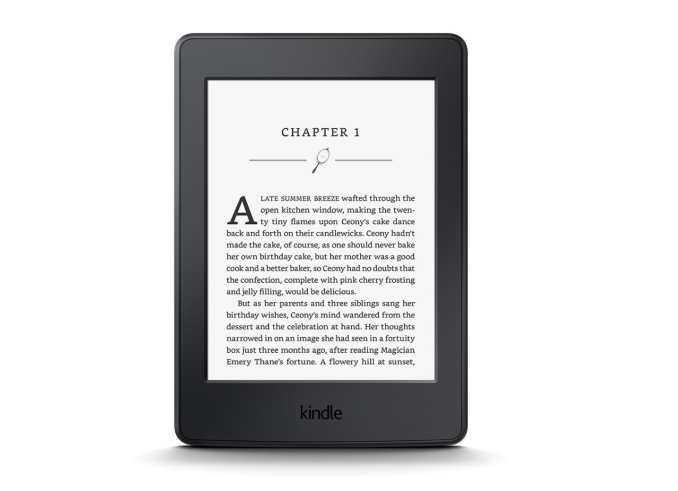
The venerable Kindle is one of my favorite tech devices. I owned the Kindle 3, but the obvious shortcoming was the lack of lighting, forcing me to use a case with a clumsy light attached. The minute the original Kindle Paperwhite was announced, I quickly ordered a couple of them and they are to this day one of my favorite pieces of technology. The Paperwhite added a “light guide” layer to the display to evenly distribute the light from the LEDs found in the bezel, which gives the e-ink display the bright white image and makes it much easier to use in dim or dark scenarios.
In 2014, Amazon released the Kindle Voyage to the US market, which is their highest end Kindle yet. It features a 300 ppi e-ink display. Today, that same display is making its way to the mid-stream priced Kindle Paperwhite which should give it even better text rendering. The new version of the Carta e-paper display has double the pixels of the outgoing model.
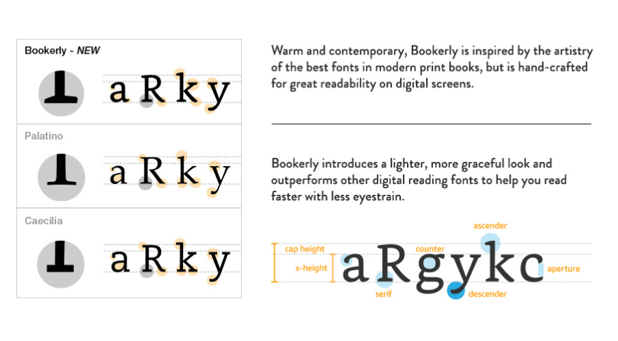
Amazon is also offering the choice of a new font called Bookerly, which was created specifically for reading on digital screens: “Bookerly is inspired by the artistry of the best fonts in modern print books, but is hand-crafted for great readability at any font size.”
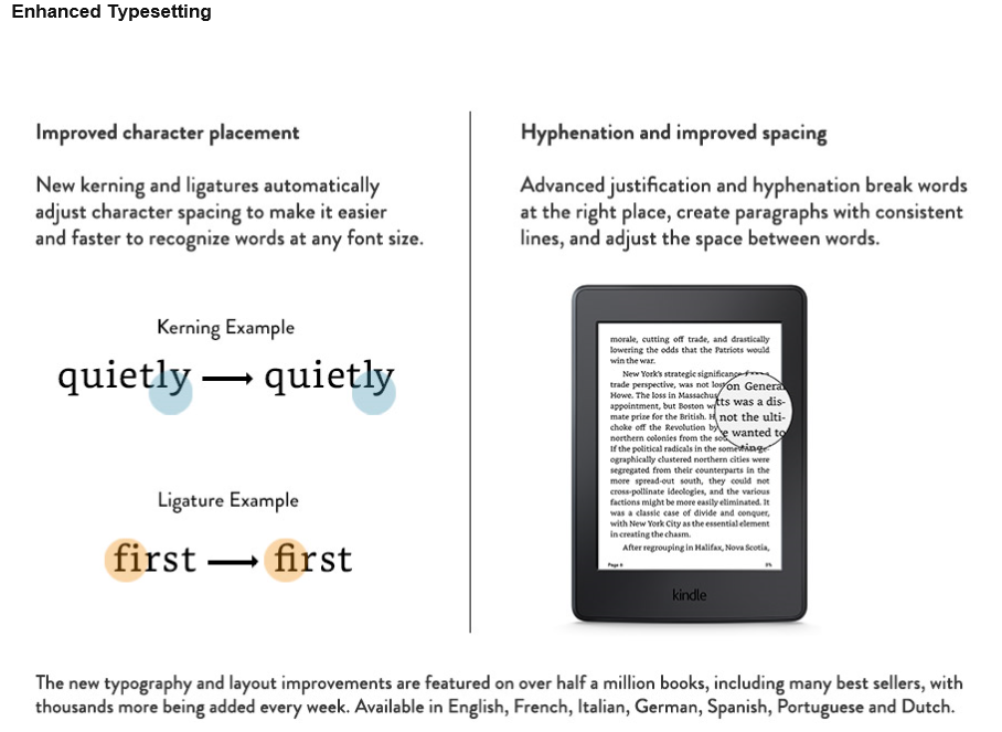
Also announced is a new typesetting engine which is listed as “coming soon” which offers improved character placement. They have adjusted the character spacing and the new typesetting engine will do a better job of justification and hyphenation of break words to create more consistent paragraph layouts. Amazon states that this will let you read faster with less eyestrain than the current engine.
The current features like note taking and word lookup are of course staying, but will be joined by new features like Page Flip which lets you skim ahead without losing your place. I prefer to read a book the way it was written, but I know a couple of people who like to look ahead and see what’s going to happen so this will be a nice feature for them.
| Amazon Kindle Paperwhite Specifications | |
| Display | 6" Paperwhite display with Carta e-paper technology and built-in light 300 ppi, optimized font technology, 16-level gray scale |
| Size | 6.7" x 4.6" x 0.36" (169 mm x 117 mm x 9.1 mm) |
| Weight | 7.2 ounces (205 grams) Wi-Fi 7.6 ounces (217 grams) Wi-Fi plus 3G |
| System Requirements | None; fully wireless and no computer required |
| Battery Life | A single charge lasts up to six weeks (30 minutes of reading per day, wireless off and light setting at 10) Battery life will vary based on light and wireless usage |
| Charge Time | Approximately 4 hours from a computer via USB cable |
| Wi-Fi Connectivity | 802.11n (WEP, WPA, WPA2 security) Wi-Fi Protected Setup (WPS) Optional 3G Wireless on Paperwhite 3G |
| Content Formats Supported | Kindle Format 8 (AZW3) Kindle (AZW) TXT Unprotected MOBI PRC natively HTML Word (DOC, DOCX) JPEG, GIF, PNG, BMP (through conversion) |
| Included in the Box | Kindle Paperwhite, USB 2.0 charging cable and Quick Start Guide |
| Price | Kindle Paperwhite: $119 With Special Offers, $139 Without Kindle Paperwhite 3G: $189 With Special Offers, $209 Without |
The Kindle is practically the definition of a uni-tasking device, but what it does, it does really well. The battery life is one of the keys to the experience, and Amazon states that the new Paperwhite can last up to six weeks if used for thirty minutes per day with the wireless off and the display at level ten. That works out to twenty one hours of usage between charges, and with my experience that is likely not an exaggeration.
Size and weight play a key part in the Kindle experience as well, and the Paperwhite has a 6-inch display inside of a small and thin body, and it weighs just 7.2 ounces or 205 grams for the Wi-Fi only model. The 3G option adds a tiny bit more to the total.
The new Kindle Paperwhite starts at $119 with Special Offers, jumps to $139 without Special Offers, and the 3G model costs $189 or $209. Shipments start on June 30th.
Source: Amazon


55 Comments
View All Comments
Reflex - Monday, June 22, 2015 - link
It was backordered when I ordered mine. If they caught up, that's new and recent. The point I made was that the Voyage was selling well, given that it launched last year and was backordered until apparently just the past two months, it has indeed sold very well. After all, we are at the point where devices launched alongside it are getting refreshes.OC'd Packrat - Thursday, June 18, 2015 - link
I'd love to see the research behind the readability improvements of the new font. What field of study does it fall under?Arnulf - Thursday, June 18, 2015 - link
And I'd love to see which idiot figured out that jamming characters closer together somehow magically makes words easier to read.At least that's how I'm interpreting the image above, with examples on the right side of the arrow being the new "improved" form (which are nearly illegible) ... Too much stupid going on, just like Windows 8.
errorr - Thursday, June 18, 2015 - link
That person is long lost to history as it was a well recognized fact several hundred years ago. Kerning is a feature of all fonts except the horrible monospace monstrosities like courier inherited from the typewriter.Fonts come with Kerning tables consisting of hundreds of letter pairs which adjust distance between characters for readability purposes. The rule of thumb is to try and allow a consistent percentage of whitespace between letters. The lowercase f is a weird letter that has confounded typography for generations since it became fully distinguished from the letter s.
Ligatures are there own unique thing where certain combinations of common letters are visually interpreted differently and benefit ease of reading.
It is near impossible to get a feel of how a text reads or feels outside the context of a sentence and display. There is a lot of research to increasingly identify what aspects of typography matter and which are just style changes.
Guspaz - Thursday, June 18, 2015 - link
Try writing code with a non-monospaced font and see how long you keep thinking of them as a "monstrosity". It makes code enormously easier to read.duriel - Thursday, June 18, 2015 - link
I suppose monospace serves well in programming since code is more precise than regular free flowing text. We tend to concentrate on each character of code because details such as capitalization, exact spelling and operators can make a big difference.Regular prose however, is processed in a very different way. I find myself looking only at a few key letters and positions, and based on the context, interpolating all the content in between. Non-monospace fonts make a big difference here by giving a unique shape and size (profile?) to every word, so we don't have to read every single letter.
xthetenth - Friday, June 19, 2015 - link
Reading code as a series of words is a mistake, reading prose as a series of words is how it's done quickly. Lines of code are comparatively much shorter and consistent spacing, indentation and similar shapes of idioms are very important. For reading human language, monospaced fonts are terrible.DanNeely - Thursday, June 18, 2015 - link
You'd need to go back a lot longer than that. Roman engravings were kerned not monospaced. (Going farther back so was Greek writing or Egyptian hieroglyphics; but our alphabet is derived from the latin one so it's a more direct link.)http://www.romanhomes.com/your_roman_vacation/quar...
ArleneHansen - Monday, February 28, 2022 - link
A great joy that I feel is perhaps a future in the future. The font I love is now available for free at yofontsMumrik - Sunday, June 21, 2015 - link
I looked at it several times to make sure they arrows weren't supposed to point the other way. It's fucking awful to look at.