Hands On With Samsung's Galaxy S8 and S8+: Taller Screens and Slimmer Bezels
by Matt Humrick on March 29, 2017 11:00 AM EST- Posted in
- Smartphones
- Samsung
- Galaxy
- Mobile
- Galaxy S8
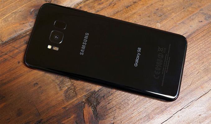
Samsung officially unveiled the latest Galaxy devices at its Unpacked event in New York today. Previous Galaxy phones were part Porsche 911 Carrera, with an easily recognizable curvaceous style, and part Swiss Army knife, bristling with technology and features. This analogy holds true for the 5.8-inch Galaxy S8 and 6.2-inch Galaxy S8+, which share the same design DNA as the previous two generations.
The new phones’ aluminum frame remains sandwiched between edge-to-edge Corning Gorilla Glass 5, with curved sides on the front and back. The curved rear glass makes the phones easier to pick up and more comfortable to hold just as they did for the S7 and S7 edge, while the curved front glass—now standard on both S8 models—adds some visual flair.
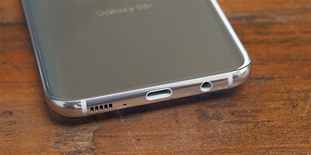
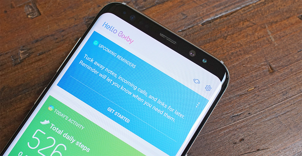
There’s not much difference between the S8 and S7 along the sides either. The USB Type-C port on the bottom is flanked by a 3.5mm headphone jack and a single downward-firing speaker. The microSD/NanoSIM combo tray still resides on the top, and the thin power button is still a bit more than halfway up the right side. The only differences between new and old lie on the left side, where the volume buttons have been combined into a single rocker and a dedicated button for launching Samsung’s Bixby assistant makes its debut. Unlike the power button, I found myself occasionally pressing the Bixby button accidentally when picking up the smaller S8.
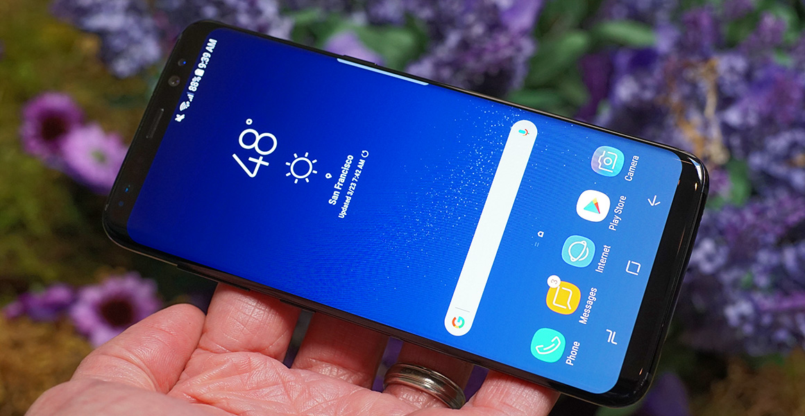
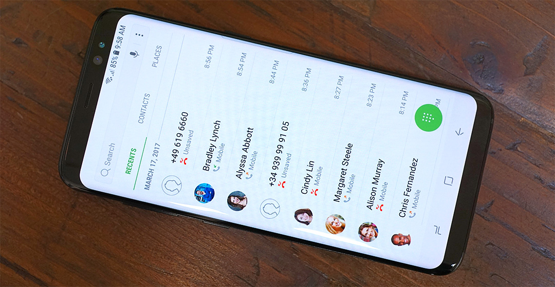
The most significant change is found up front, however, and it’s one that impacts both form and function. The Galaxy S8 and S8+ adopt Samsung’s new “Infinity Display” that stretches the screen vertically but not horizontally, deviating from the traditional 16:9 aspect ratio. The result is a QHD+ SAMOLED display with a 2960x1440 resolution and an 18.5:9 aspect ratio that’s very similar to the 18:9 aspect ratio display LG is using in its G6. Both Samsung and LG cite market research for this new display direction: People want larger screens that can show more content, but they also want phones that are useable with one hand and can fit in their pocket. The taller screen fits more content, so less scrolling, but keeps the phone narrow, so it’s easier to wrap your hand around.
Both S8 phones incorporate another emerging design trend: rounded display corners. Where LG’s G6 is using an LCD panel that actually has rounded corners, it appears Samsung is using a rounded bezel to cover the S8’s still sharp-cornered display. This avoids the aliasing that’s evident in the G6’s corners, producing a much smoother, nicer looking effect. While my time with the S8 was limited, it appears that TouchWiz and Samsung’s apps were redesigned to account for the rounded corners: Backgrounds extend the full height of the display and visual elements are still displayed along the top and bottom edges without getting cut off. Third-party apps, however, find their vertical dimensions constrained to the purely rectangular portion of the display, with the status bar above and the navigation bar below taking on black backgrounds.
The S8 and S8+ are also the first phones to receive the UHD Alliance’s Mobile HDR Premium certification that ensures a mobile device meets the minimum requirements for playback of 4K HDR video. This means that both S8s are capable of rendering at least 90% of the DCI-P3 color gamut, have a dynamic range of at least 0.0005-540 nits, and support a 10-bit display pipeline.
To keep the overall size of the phones in check, the S8/S8+ and G6 have dramatically reduced the bezel area around the taller screens. Samsung claims a screen-to-body ratio of 83% for its new Galaxy phones, less than the 91.3% of Xiaomi’s Mi MIX concept phone, but impressive nonetheless, especially considering how much hardware is located in the S8’s upper bezel. Besides the usual earpiece and proximity/ambient light sensors, there’s a new 8MP front-facing camera with f/1.7 lens and Smart AF that uses facial recognition for accurate focusing when taking selfies. There’s also an IR LED and IR camera for the iris-scanning security feature that made its debut on the ill-fated Galaxy Note7.
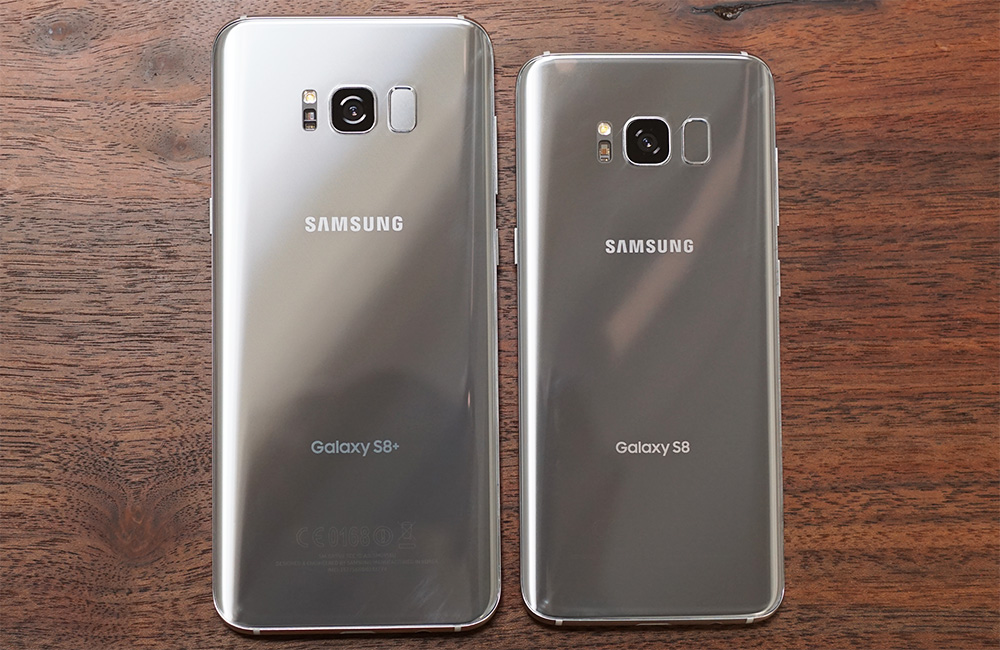
Shrinking the size of the lower bezel required relocating the fingerprint sensor to the back. Instead of placing it below the rear camera like we see on most other phones, Samsung places it next to the flush-mounted camera, which is less than ideal. Both the camera and the sensor are surrounded by a raised lip and are similar in size, making it difficult to locate the sensor by feel, and if your finger misses the sensor, you end up with a nice fingerprint on the camera lens. On the smaller S8, this issue may be mitigated with practice, but the problem is worse for the S8+. Being taller, it places the camera and sensor further from the lower edge, making it very difficult, if not impossible, to reach the sensor when holding the phone with a natural grip. Even with my larger-than-average hands, I struggled to reach the sensor without shifting my grip. I suspect people will turn to the iris scanner or the new face unlock feature, which uses the front camera for facial recognition after pressing the power button, to overcome the poor fingerprint sensor placement. The physical home button and capacitive navigation buttons, iconic Galaxy design features, have also been evicted in favor of the slimmer bezel, replaced by onscreen controls.






208 Comments
View All Comments
F1shbone - Thursday, March 30, 2017 - link
I agree. Samsung usually comes up with two flagships a year so they incorporate what technology they can at that point. There is always a rush to the market. There is always the next model. Moreover this is a crucial phone for them to get back on track in a timely manner after the Note 7 fiasco. Over all the placement of the fingerprint scanner is just a minor nuisance, especially considering the iris and face unlocking. More importantly the phone is gorgeous! And from videos I've seen it's ergonomics in hand are a step up from earlier iterations. Also the looks and design are super important as I believe that's the thing to set the S8 apart from (way cheaper) competition and help justify it's price point to more people. The current fingerprint reader placement was just the best compromise at the time with the new synaptics sensor not yet ready to ship.lolipopman - Saturday, April 1, 2017 - link
By that logic, nothing is subjective. Would you agree that it is instinctual and in human nature to find fat people ugly, disgusting and revolting?marcolorenzo - Sunday, April 2, 2017 - link
Nature is symmetrical? Maybe metaphorically as in, what goes up must come down; every action has an equal opposite reaction blah blah blah but in terms of actual appearance, it is certainly not symmetrical in most cases. Ever seen a perfectly symmetrical tree?Anyways, I would've argued that Samsung tried too hard to be symmetrical by placing the fingerprint scanner next to the camera to counterbalance the flash on the other side.
Ratman6161 - Monday, April 3, 2017 - link
"they have it cozy and easy because people are for most parts dumb"I would replace "dumb" with " uninformed. its pretty typical techno geek to consider people dumb because they don't understand. I myself am a techno geek and I've been fighting this attitude that the user is dumb so hard and so long I'm about ready to give up and retire.
Users are not dumb...they just don't know as much as you do, so try a little harder to educate without the name calling.
masouth - Tuesday, August 1, 2017 - link
I agree with you mostly Ratman but unfortunately there are still large numbers of dumb users out there. Not just ignorant, dumb.Although I have found that the ones who willfully acknowledge that they are ignorant or dumb can also tend to be some of the best people to work with/ for since they don't let their ego get in the way of what you are trying to do...at least not nearly as much as the ones who think that they know it all.
Jon Tseng - Wednesday, March 29, 2017 - link
>Do you also hate the lack of symmetry on your own face? Because it is not perfectly symmetrical.Um, you do know a human face and a smartphone are different things?
Pretty stupid to compare them according to the same criteria. Thats like saying you dont like someones face because it very hard to read text from it in low light conditions...
mkozakewich - Wednesday, March 29, 2017 - link
Relationship problems.close - Thursday, March 30, 2017 - link
If you can pick "symmetry" as the unquestionable mark of beauty then why can't I pick "ability to display high contrast illuminated text" as one? I think everyone agrees fuzzy, illegible text sucks but not everyone agrees that symmetry is the best (which is why probably half of the products around you aren't perfectly symmetrical).RMSe17 - Wednesday, March 29, 2017 - link
Cellar Door - don't be evil.Reflex - Wednesday, March 29, 2017 - link
You should just do what I do. Remove the guts of the phone and make note of where items need to be. Pop the problem into SolidWorks and design a new casing that puts the items you want to move where they need to be, then hit up a CNC shop for a custom manufactured casing. It's a bit more work, but you will have a more durable product that lasts longer, and less design irritation.;)