Three Months with Microsoft's Office 365
by Vivek Gowri on January 31, 2013 11:59 PM EST- Posted in
- Microsoft
- Cloud Computing
- Office 2013
- SkyDrive
Generally, Office 2013 works pretty similar to Office 2010, with an interface heavily reliant on the ribbons. Now, I’ve always been a fan of the ribbons, which I thought were a good idea in Office 2007 but really came into their own with Office 2010. It’s been six years since they debuted, so anyone that is still complaining about Ribbon UI should really get over it, especially now that Windows Explorer uses it as well.
The aesthetic has been updated to match the Metro visual style that forms the basis of the Windows 8 and Windows Phone 8 UIs. This visual style has left me a bit cold in Windows 8 Desktop - I like the UI chrome in Windows 7, I feel it gives the interface some three-dimensionality and offers more natural interactions. But in Office, the chromeless aesthetic is awesome. I think it works really, really well in Word and PowerPoint especially, where the starkness and simplicity of the UI (particularly in the hidden command or hidden Ribbon modes) gives you a very blank slate to work from. It’s clean and pure in a very fundamental sense, with no visual distractions at all in the UI.
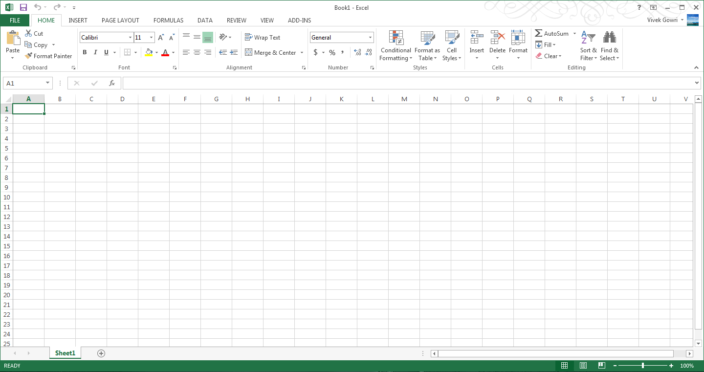
I’ll also note that the refreshed interface has little to no effect on Excel, which has looked and felt exactly the same since I first used it in Office 97 as a five year old. It’s like the Porsche 911 - no matter what changes under the hood, externally it has looked the same for decades it seems like. Not that it’s a bad thing, since I love the 911 and love-hate Excel, but it’s worth mentioning nonetheless.
Generally, it seems like the Office 2013 has a much stronger focus on the visual style of the content being created than I’ve noticed in previous editions of Office. There’s much more aesthetic polish, with rich templates that aren’t worthless like they have been in many previous editions of Office, nicely styled titles and headers, and many more document design capabilities. Until you use it, it’s really difficult to overstate how much cleaner documents that come out of Office 2013 look. It’s now much easier to create content that are visually pleasing - documents and presentations that just look good and are easy to read without needing to spend a ton of time on formatting.
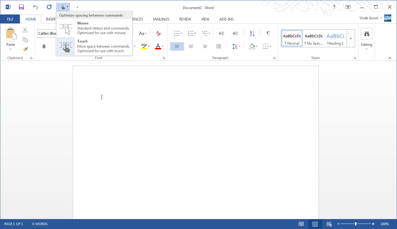
Microsoft is including two input modes: mouse (Office as we know and love it) and touch, which expands the size and spacing between menu options for a more finger-friendly interface without dumbing it down. Look closely at the below screenshot versus the one at the top of the page to get an idea of what I'm talking about. It’s decent to use, but obviously, creating content using the touchscreen keyboard is an outright pain, so this is more for navigation, minor editing, and formatting changes. You will obviously get more out of any office suite with a traditional keyboard and mouse setup, but the new Office at least has a more touch-centric UI as an option.


113 Comments
View All Comments
mevans336 - Friday, February 1, 2013 - link
What is it in?VivekGowri - Friday, February 1, 2013 - link
Mechanical Engineering. Already graduated actually, diploma is in the mail :)mevans336 - Friday, February 1, 2013 - link
Awesome, congratulations! What school?Samus - Saturday, February 2, 2013 - link
All my buddies (and myself) have ME degrees (I don't have a masters) and they have vast flexibility with employment. I've had jobs ranging from Ford to IT consulting. I did go back to school for an associates in EE, but its funny that none of us any longer have a typical ME job. One of us is a truck driver, lol!p05esto - Friday, February 1, 2013 - link
I really dislike the UI and graphical style of this and Win8. It's 2013 and the interface so totally boring, no color, no shading, no shadows, doesn't pop or anything. Why 1 color icons, can't we make things look nicer than this? Maybe it's a small thing, but it all looks cheap and uninspired, so cold and boring. No thanks to the Modern UI.B3an - Friday, February 1, 2013 - link
Yeah exactly, it's 2013. Not 2005.If you like dated graphic design, things like gradients, shadows, shiny icons, gloss, material emulation and pointless rounded corners then either go back to 2005 of use iOS or OSX.
Speaking as a designer i can safely say that pretty much all modern design is heading this way. Including site designs. Whenever you see a new design of a major site it's nearly always more Metro-ish looking. Thats because it's better, it's cleaner, it's more efficient, it focuses more on content not pointless chrome, it cuts out then needless crap and most people prefer it.
Wall Street - Friday, February 1, 2013 - link
But the UI is horrible. IT doesn't indicate what is clickable or not and has a poor use of white space. The best interfaces have a good user experience and build the aesthetic around that. Metro clearly had the aesthetic laid out before they made the interface.Murloc - Friday, February 1, 2013 - link
apart for the removal of gradients and juicy looking 3D icons, it's very similar to 2010.In 2010 you can see what is not clickable because it's greyed out. I guess it's the same in 2013.
The icon style changed but other than that there's really no difference in looks.
Murloc - Friday, February 1, 2013 - link
look at the copy button in the first image of the look and feel page: it's greyed out.Flunk - Friday, February 1, 2013 - link
Actually, it's very easy to tell what's clickable. Everything that's not the background color is clickable.Actually the Windows 8 UI uses far more color than the old interface did and it uses them for informative purposes, not just graphical bling. It's content over all else and functionally it's much better than the old 1990's style of psudo 3D everywhere which basically only tells you what you can and cannot click.