Microsoft Releases Windows 8 Release Preview; NVIDIA & AMD Prep New Win8 Drivers
by Ryan Smith on June 1, 2012 6:30 AM ESTClosing out the month of May, Microsoft gave everyone an early present by putting up the final preview version of Windows 8, the Windows 8 Release Preview. Originally expected in the first week of June (i.e. next week), this is a hair earlier than expected and get the OS preview out just in time to show off at Computex and E3 next week.
Traditionally as Microsoft moves farther along with their OS builds their focus changes from adding new features to refining those features and bug hunting, and the Windows 8 Release Preview is no different. Most of the functionality we saw in the Consumer Preview remains untouched – including Metro and most of the ways to interact with it – so if you’re familiar with the Consumer Preview then you’ll be right at home with the Release Preview. What remains is Microsoft’s final feature development efforts as that begins to wind down, which means a smaller number of new features for the Release Preview alongside a more comprehensive shakedown of the OS.
We won’t reiterate all the new features of the Release Preview (this is what MS’s blog is for), but we’ll quickly touch upon the major ones. Multiple monitor users who found themselves frustrated with how the Consumer Preview didn’t even try to meaningfully handle multiple monitors will be happy to see that Microsoft has finally tackled multiple monitors and implemented proper control interfaces for multiple monitors, though like everything else about the Windows UI it’s distinctly different from Windows 7. Meanwhile laptop users will be releved to find that Microsoft has finally implemented support for trackpad gestures (à la Mac OS X) for multi-touch trackpads that are supported. And everyone will be happy to see that Microsoft has fully implemented the new and greatly improved Check Disk utility, which can now avoid having to take a filesystem down to do most verification operations.
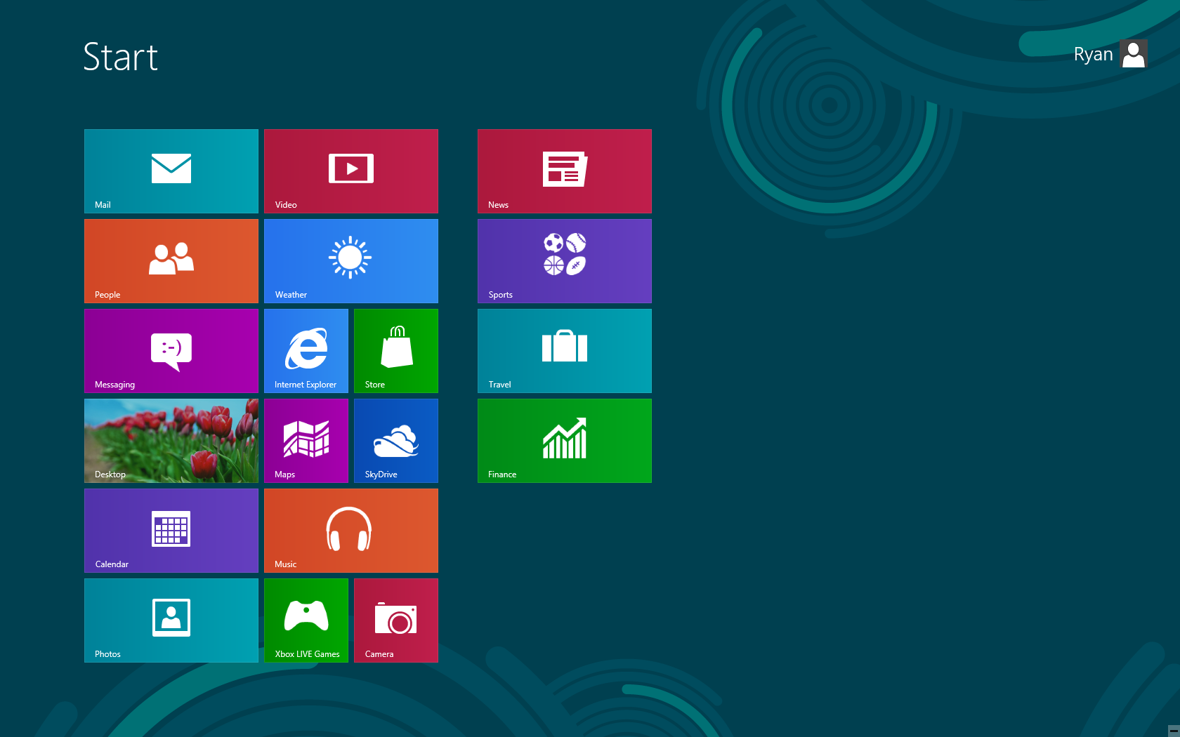
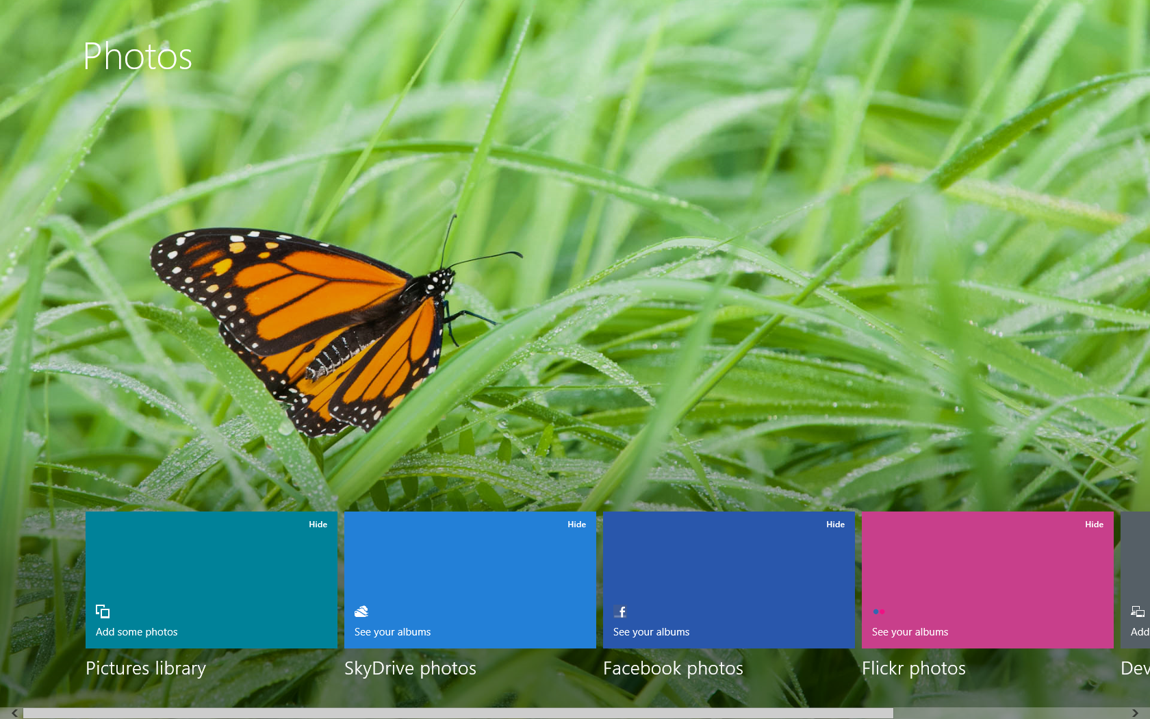
As for the application side of things, Microsoft has continued to work on their default Metro applications, which were in an early state in the Consumer Preview. In surrender to sites that can’t/won’t drop Flash, IE10 now integrates Adobe’s Flash Player for use with pre-approved sites, in a process that sidesteps the fact that IE10M doesn’t allow plugins. Elsewhere the Mail, Video, Messenger, and Photos applications have all been overhauled, and News and Sports applications have been added.
The only known feature addition you won’t find in the current Release Preview is the new desktop UI. The Release Preview still uses Aero Glass, however MS has announced that for the release version of Windows 8 they will be switching to an unnamed, lightweight UI that does away with the glassy features of Aero in favor of something closer to a very flat version of Microsoft Office 2010. The only other features not currently exposed in the Release Preview are a few Pro features, such as Windows Media Center, which is remaining unchanged anyhow.
The New Unreleased Windows 8 Desktop UI
Wrapping things up, as is customary Microsoft is offering a Windows upgrade program to new computer buyers in order to keep computer sales from grinding to a halt ahead of Windows 8’s launch later this year. New computers purchased from Microsoft’s partners after June 2nd will be able to upgrade to Windows 8 Pro for $15. This is a slight deviation from the past, as previously Microsoft would offer a straight upgrade (e.g. Home Prem to Home Prem) for free. Instead every computer buyer is getting Windows 8 Pro, but they also have to pay $15 for it. Compared to the retail price of an upgrade this is cheap, however it’ll be interesting to see how buyers react since there’s a big philosophical difference between free and not-free regardless of the price.
Assuming all goes according to schedule, Microsoft is looking at hitting RTM in a few months. For reference, the release version of Windows 7 was built on July 13th; Windows 8 won’t be ready quite that soon, but as long as it stays on schedule we’d expect it to be finished this summer. Microsoft still intends to launch it into retail for the holidays this year, so consumers can look forward to a shorter gap between when the OS hits RTM and when it actually shows up in stores.


Finally, for anyone on the fence about Windows 8 and whether they should bother to test or evaluate it at this point in time, Windows guru Paul Thurrott sums things up nicely: “it’s time to start evaluating Windows 8 as it is, now, in the Release Preview, and not looking forward to some future where whatever forces will come together and deliver some more complete vision. There’s no more complete vision coming. This is it. This is Windows 8”.
New Video Drivers
Alongside the release of the Windows 8 Release Preview, AMD and NVIDIA are both in the process of releasing new video drivers for Windows 8. As you may recall, Windows 8 introduces WDDM 1.2, which both companies will be supporting with their DX11 generation hardware. The good news is that both AMD and NVIDIA have gone from a work in progress to competition very quickly; in NVIDIA’s case their first display driver will be WHQL certified, and AMD should be closely behind.
For AMD users AMD has upheld their promise to deliver new drivers on the day of Windows 8 release previews, offering up a new Windows 8 driver that supports the Radeon HD 5000, 6000, and 7000 series, along with their respective FirePro counterparts.
NVIDIA on the other hand will be releasing their drivers next week, presumably due to the hold-up on WHQL certification. In the meantime testers will be in a bit of a bind; they will either need to use NVIDIA’s existing Consumer Preview drivers, use the out-of-the-box Windows 8 drivers, or forcibly install Windows 7 drivers.


23 Comments
View All Comments
hornetfig - Friday, June 1, 2012 - link
hmm, I'm not so sure about the Aero Glass thing. All the non-chrome theming has been updated and reflects what was announced in the blog post. All they were doing was, seemingly, for the window chrome was putting the DWM in non-transparent mode (which was always a checkbox option in Vista/7). The comments on the blog post went bezerk at the loss of chrome transparency. So they might just keep it for machines on AC power - it doesn't really cost anything to do so.MrSpadge - Friday, June 1, 2012 - link
I get the feeling they're trying to make the desktop ugly in order to push metro.EnzoFX - Friday, June 1, 2012 - link
Aero is ugly. It's simply gives the desktop a clunky feel. Not only do you have things showing through the glass, adding to the cluttery feeling, but glass in itself to me is the idea of something heavy. I've never liked it, so so glad they're getting rid of it.Do people not see the trend of transparency going out? IMO it was out before Win7, but Win usually was behind the times in terms of design.
ssj4Gogeta - Friday, June 1, 2012 - link
I never thought it was clunky or heavy. It's all hardware-accelerated. If my GPU can handle games, it can handle a bit of transparency just fine. Why not use that power? Now I'm not saying that's the best way you can make the UI better using the GPU. What I'm saying is dismissing Aero because it uses transparency doesn't make sense to me.B3an - Friday, June 1, 2012 - link
I dont think he was saying it was heavy on the GPU.The transparency is cheesy in 2012 though, plus it gave a cluttered feel as already mentioned. And i hate how when you maximise a window in Vista/7 it still has transparency along the top bar - i dont want to see the crap behind it! Other things of Aero were bad too... all the gradients, shiney effects, glows and all the other cheese. The new updated desktop UI looks MUCH better and cleaner, something thats from 2012.
I think MS might even update the icons in the RTM. I really hope so, most of them are still from Vista and look out of place/dated.
Tarrax - Saturday, June 2, 2012 - link
It's not cheesy(?) at all, it's modern. The transparency and other effects look fine too. The new W8 UI is simply lazy and will look like a step backwards, not to mention just plain ugly. Looks very 90s, not 2012 at all.Of course, just like the previous poster, this is all just an opinion. ;)
B3an - Sunday, June 3, 2012 - link
It's not opinion at all. Each era has it's specific design look. From looking at things we can often tell what decade it was made in.I work in graphic design and have for 13 years, and things have been heading towards the Win 8 Metro look for a long time.
Even if you look at site designs like AnandTech, look at the buttons and layout of this latest design. Flatter, cleaner and square with more emphasis on colour and typography. Or look at sites that are new or have recently been updated like The Verge and Arstechnica. Both look far more Metro-ish. Theres thousands of examples i can give though. Even Amazon or Ebay have been slowly moving to this look over the years. The same with console UI designs, Smart TV interfaces and everything else. Android 4.0 has also started moving in this direction.
Almost all designs have gradually been moving away from shiny graphics/icons, gradients, glows, emboss effects and other cheesy stuff. The Aero look in Vista/7 and the interface for both OSX/iOS ARE undeniably dated. OSX has atleast just started to move in this direction though (button corners have recently been made more square and things have been flattened very slightly).
WP7 and now Win 8 have literally skipped ahead of almost everything else out there and gone straight to a modern design, it's a bold move by Microsoft and they're leading everyone else. In a few years just watch how Android and OSX/iOS start looking more similar, it's already happening.
Arbee - Friday, June 1, 2012 - link
"Glassy" theming has been on it's way out for a few years now. Apple, who started that bandwagon, started toning it down a lot in Snow Leopard and Lion is flat looking to the extent that it's almost like using System 7 again (which isn't a bad thing). MS has been following a similar trajectory: Vista overdosed on the bling, Win7 toned it down a lot, and now it looks like Win8 will have a flat look.B3an - Friday, June 1, 2012 - link
MS were the first to really push the flat/modern look with WP7.OSX still has tons of gradients, overly shiny buttons and large shadows. Hardly flat looking! Compare some screen shots of Mountain Lion to Win 8. Big difference, OSX is still all about eyecandy and bling. Win 8 looks clean and modern, while OSX doesn't look all that different from 10 years ago.
It's ironic that its now MS that are making Apple UI look dated. Apple are even worse than Aero was in some regards, as they try and emulate real world surfaces like metal and wood in their UI. Everyone else has been dropping this over many years. Infact 10 years i was designing UI's with the effects OSX still uses!
Pantsu - Friday, June 1, 2012 - link
I think it's good that they're trying to create at least some sort of confluence between Metro and desktop, and Aero glass isn't anything like Metro. One of my concerns with W8 is that jumping between the desktop and Metro is too jarring.